Smashbox came out with this palette as part of their 2014 Holiday Collection . The collection was pretty wide, too. It had 2 eyeshadow palettes, a set of pencil eyeliners, a set of lip glosses and I believe a brush set. This particular palette It has 12 eyeshadows, 11 of them are either shimmery or satin and only 1 is matte. While the other one (On the Rocks Luxe Palette), had 28 shadows I think.
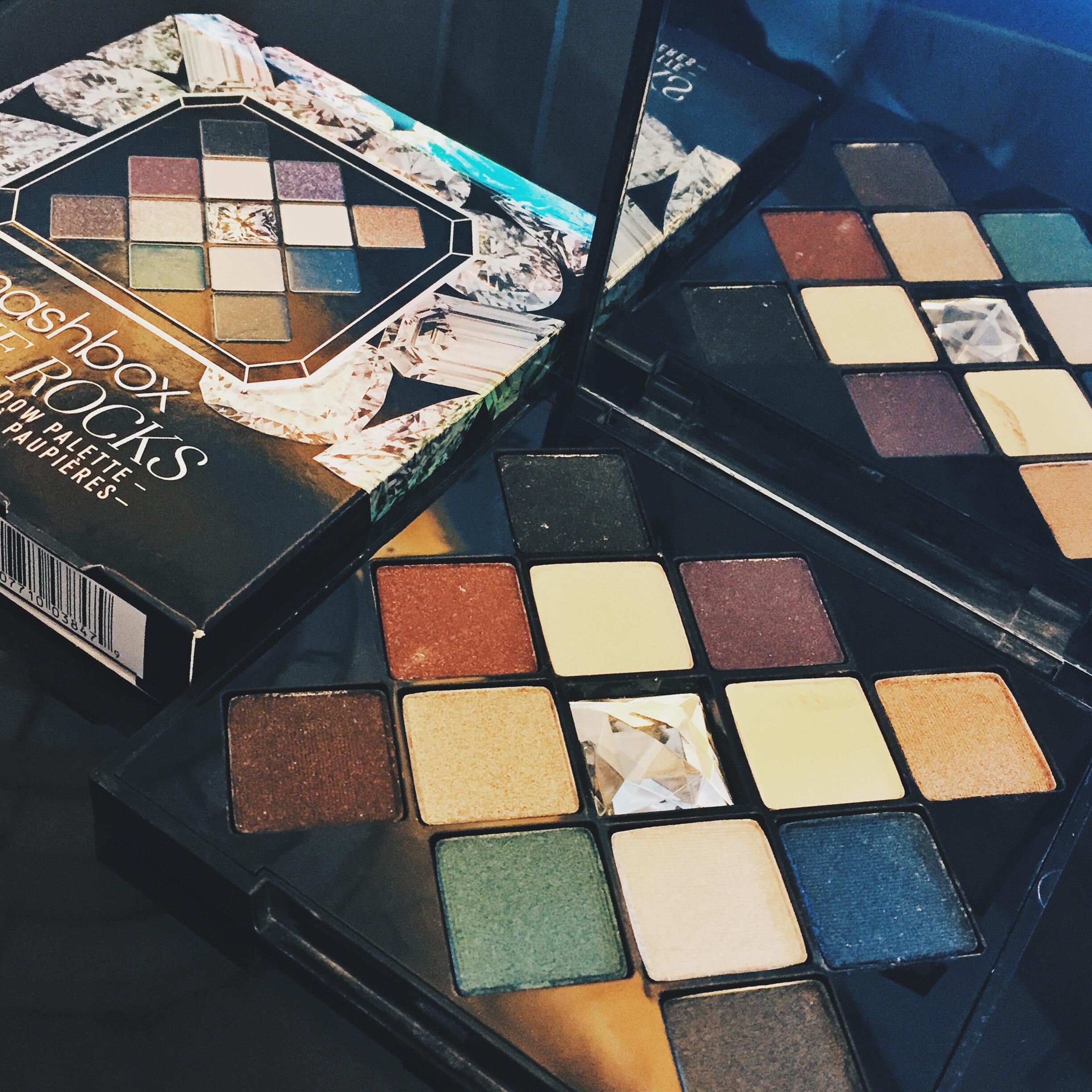
The packaging is a sturdy, plastic case that close with a clasp, so it’s good and you know it’s not going to flip open when you travel with it. It also has a nice sized, good quality mirror, which again is great for travel or just when you’re doing your’re makeup at home.
Here are some description and swatches for you guys:
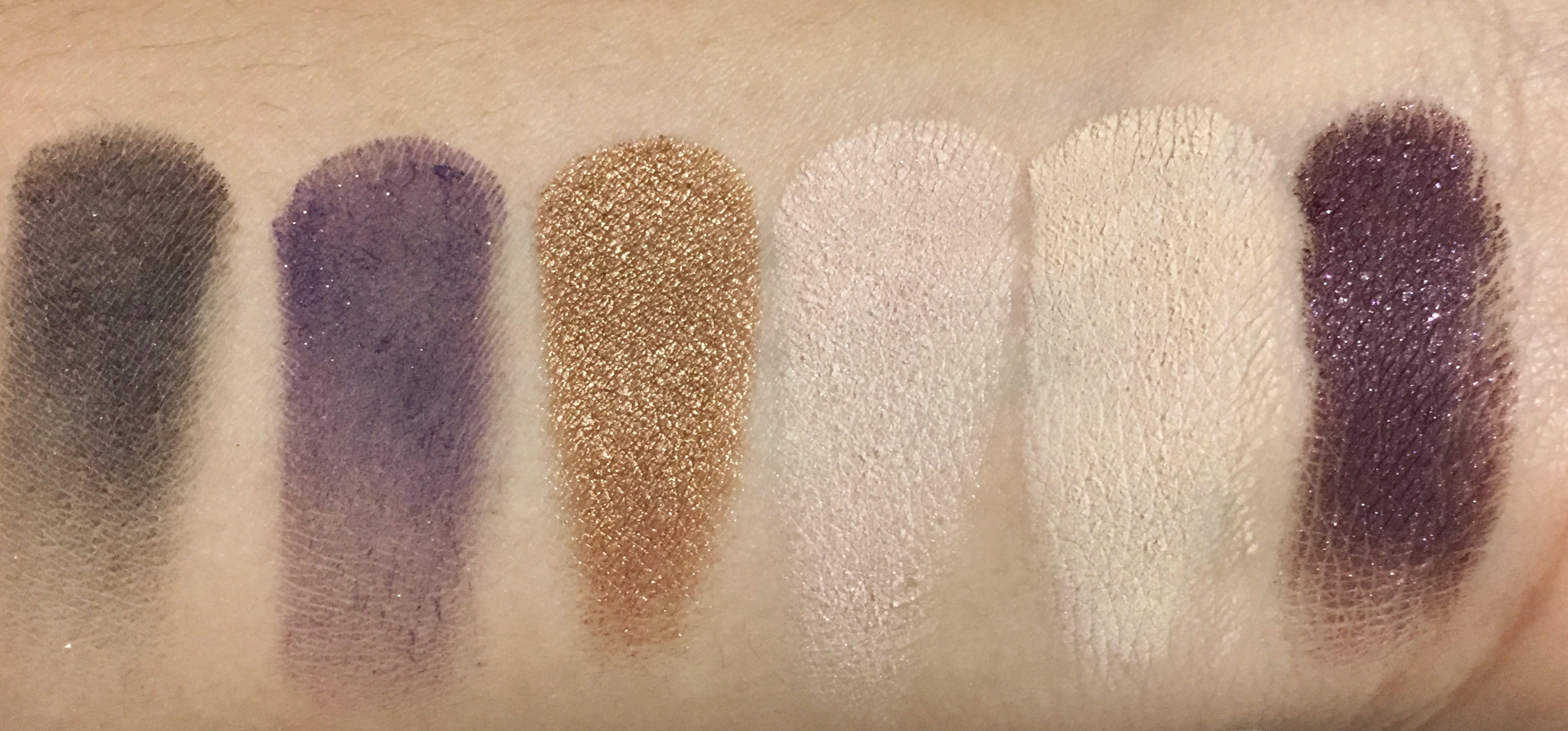
Left to Right: Blacktop, Coronation, Nutmeg, Opus, Vanilla & Chianti
Blacktop – is a black eyeshadow with silvery micro shimmer. As mentioned in my instagram post, this swatch does this color no justice, because it is definitely a black eyeshadow. It may seem pretty shimmery, but actually once you blend it in, the finish is pretty matte.
Coronation – is a purple eyeshadow with gold micro glitter, so beautiful on brown or green eyes! The texture is soft, very creamy and easy to blend. Like Blacktop, this color is also introduced as a shimmer, but the finish is matte once blended in, and there’s only very little hint of the gold shimmer.
Nutmeg – is a warm-toned gold, shimmery satin eyeshadow. It’s a great all-over eyeshadow, I actually used this in place of The Balm’s Cindy Lou-Manizer as a bronzer topper/highlighter, it’s slightly more on the yellow side, but it works just as great. Also, I just have to mention that this is the most buttery among all the shadows in this palette.
Opus – is a very light, cool-toned pink, which is a satin finish eyeshadow with hints of iridescent / light reflecting shimmer. it’s great for diffusing edges, may also be used as an all-over lid shadow and inner corner highlight. Same as the other mentioned shadows, this is soft and creamy, really easy to blend.
Vanilla – is a light yellowy-beige shadow and is the only matte shade in the palette. Very buttery, pigmented and is even a great under eye setting powder. Yes, I dared try it under the eye. Very brightening! :p
Chianti – is a beautiful, cranberry, plum-y, reddish brown shade with multi-colored micro glitter. If there was one shadow from this palette that I absolutely love, it’s this one. The impression is pretty shimmery, but once blended, the finish is actually pretty much matte.
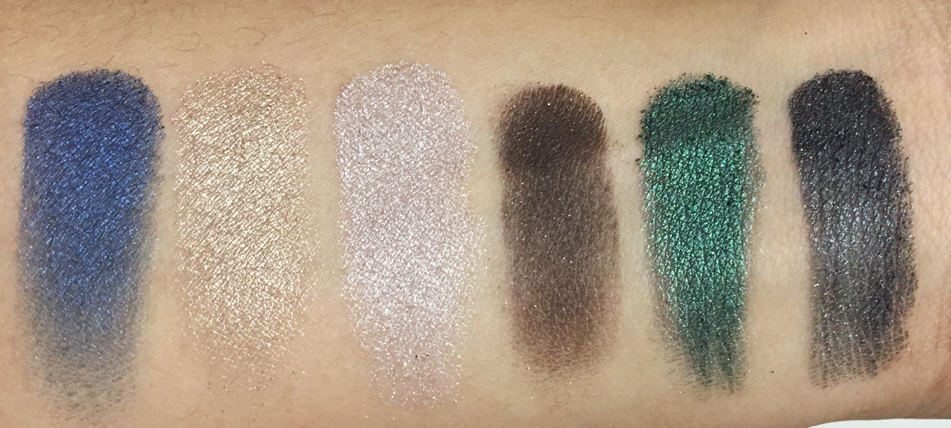
From Left to Right: Sapphires, Confectionette, Mist, Bourbon, Midnight Emerald & Obsidian
Sapphires – is a deep, ocean blue with reflective, blue micro shimmer. I rarely like blue but this color, I’d go back into over and over. It’s a blue that doesn’t lean towards green, which I love and I find that it really looks good on brown eyes.
Confectionette – is a shimmery satin, white gold color. Decent color pay-off but there’s noticeable fall-out. Not my favorite from this palette, but it’s not bad at all. From what I can tell from the texture, it’s the driest among all the shadows and I find that I like to use this better as a face highligter than an eyeshadow.
Mist – is a shimmery satin, lilac color. It has a hint of gray or taupe in there, It’s definitely a very shimmery satin, pretty similar to Confectionette, only this is a little bit softer in texture compared to the former, also very powdery and the fall-out leaves a shimmery cast.
Bourbon – another one of my favorites from this palette. It’s a rich, dark brown with gold and red micro glitter. It’s not really unique, but what’s wonderful about this color is the texture. It’s soft and creamy, very easy to blend, very pigmented. Can’t really say much more than that because all it is to me is just beautiful brown goodness.
Midnight Emerald – can we just take a minute and appreciate this green? I have a few greens in my collection but they always become blue when I blend it in. It’s a shimmery satin green shadow, it’s more of a moss green though than an emerald, but it is a green that stays green so I’m very pleased with that. Looks great on brown eyes, for sure.
Obsidian – is a shimmery, blackened gray with a lot of of multi-colored shimmer. The texture is smooth, very blendable and does build up to be a black, so that’s a nice option if you don’t want a straight up black like Blacktop.
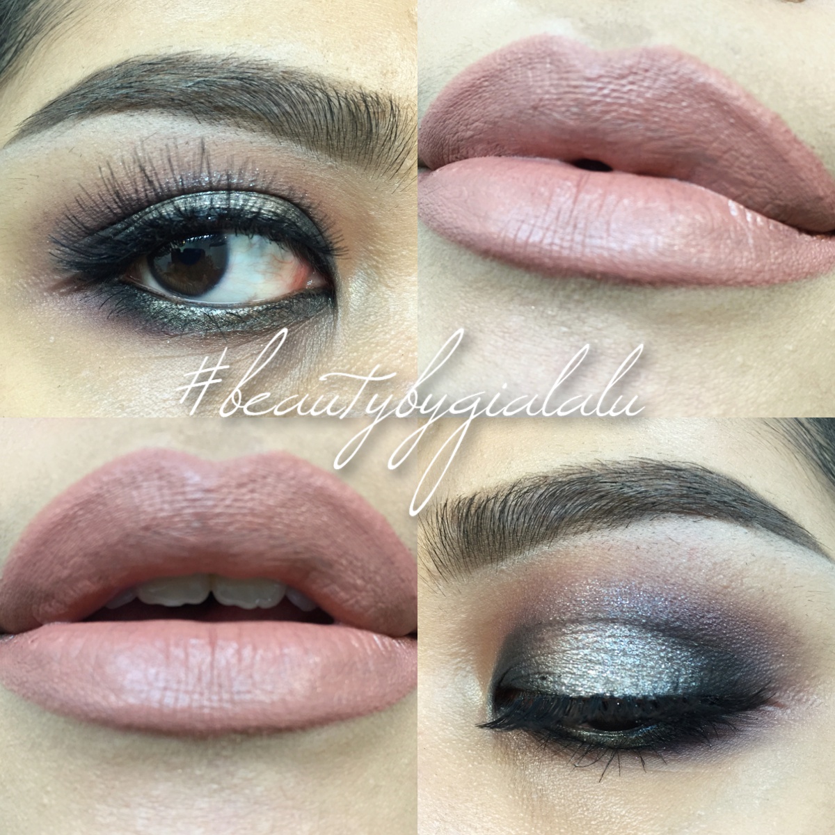
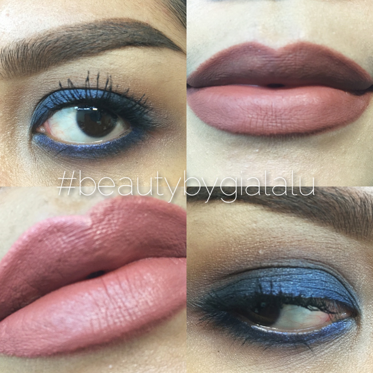
Eyes: Bourbon, Chianti, Blacktop, Vanilla & Confectionette | Lashes: Redcherry 523 | Lips are ColourPop Lippie Pencil in Skimpy & ColourPop in Lippie Stix in Cookie
Over all, I thought this palette turned out better than I expected. The Photo Op formula is (almost) always perfection! and Smashbox did really well, again.
The shadows did have some kick up when you swirl the brush in the pans, but they were all very pigmented and beautiful on the eyes, except maybe for Mist, the purply grayish tone in that shadow is simply not the most flattering thing.
This palette did kind of disappoint with having only 1 matte shadow, and it having to be a highlight color, but Blacktop, Chianti and Bourbon turned out to look more matte than shimmery, so that makes it a lot easier to be able to create full looks for this palette.
Also, the shadows from this palette work nicely with other eyeshadows (brands). In this look I used the color “Fawned of You” and “Be You” from Too Faced as transition shades, Sapphires on the mobile lid and a combination of Chianti and Bourbon in the crease to blow out the edges.
Lastly, I wish they put another shadow in place of this little gem thing in the middle, perhaps a midtone matte brown would have been best. or they could have taken out the color Mist from this palette because that is just a hair different in tone than Opus, I felt that it was a really unnecessary color to be included in the palette.
And there you have it! That completes my review of the Smashbox On the Rocks palette, I will soon receive the Smashbox On the Rocks palette, I may (or may not) post a comparison or swatches of the shadows included in that palette.
I hope that this is helpful to some of you. Thank you for stopping by and I’ll see you again next time!
XO,
Gia

I love your blog, it is so beautiful! I just followed you, it would be great if we can support each other 🙂 I am so glad I got to discover you ❤
LikeLiked by 1 person